LOGO
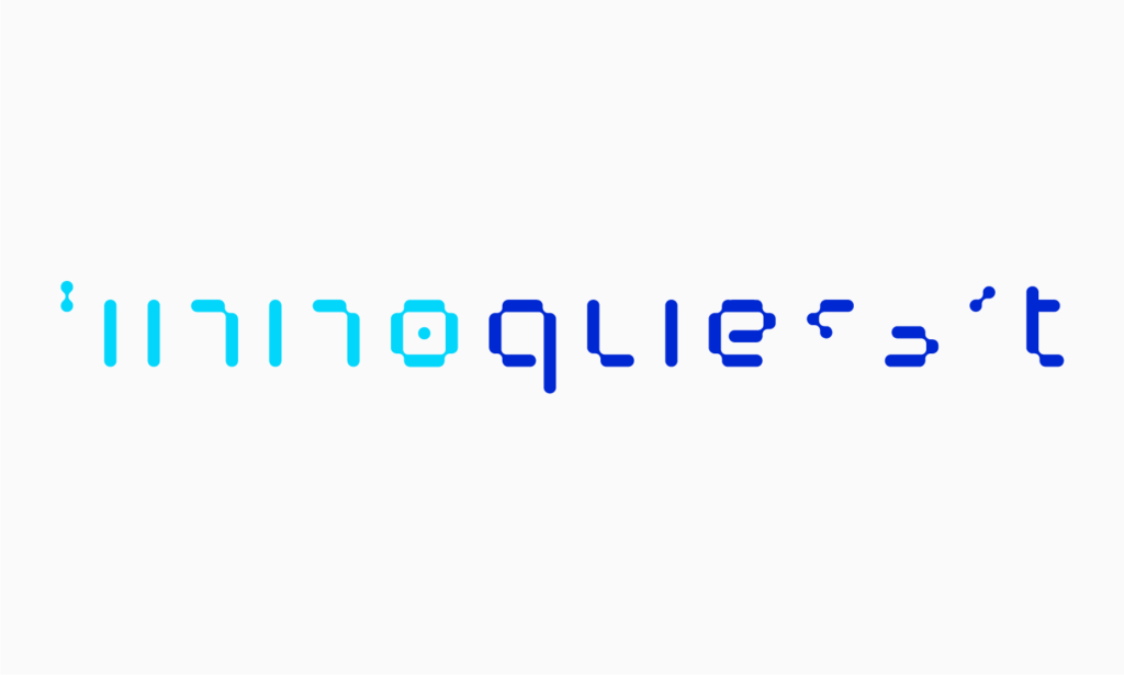
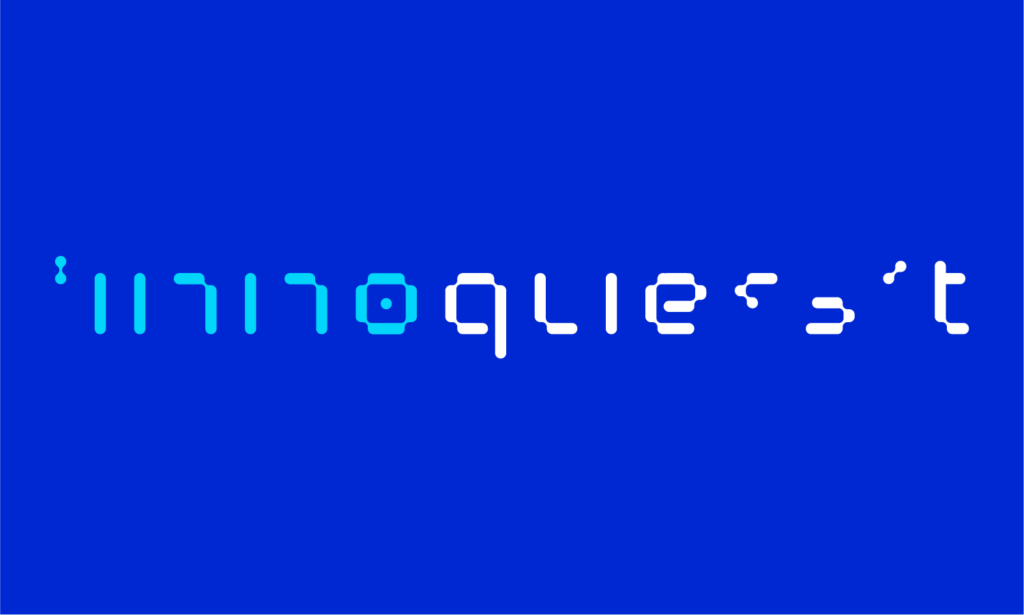
The Innoquest Logo is a unique typeface inspired by the combination of the coding language of ‘1’s and ‘0’s and the cocci, bacilli and spirilli shapes found in bacterial cell structures under the microscope.
The innoquest logo is available in four styles - reverse colour, colour, black and white. The colour logos should always be used where possible. The Black and White Logos should be used in instances where there are colour limitations.
REVERSE COLOUR
COLOUR
BLACK
WHITE
Our tagline "In pursuit of science, innovating for life" is set in Rubik Regular typeface. The Innoquest Logo with Tagline has a fixed relationship and is available in four styles - reverse colour, colour, black and white.
TAGLINE
LOGO WITH TAGLINE
REVERSE COLOUR
COLOUR
BLACK
WHITE
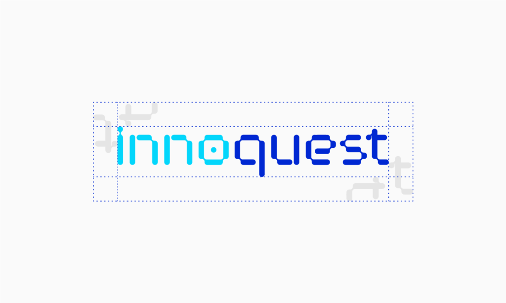
A clear space should be kept around the logo as shown below. The logo should always be positioned prominently, where it is not obscured by typography, other graphic elements or against a busy image.
SPACE REQUIREMENTS FOR LOGO
SPACE REQUIREMENTS FOR LOGO WITH TAGLINE
The Innoquest reverse colour logo in a circle can be applied in environments where the logo requires more prominence, i.e. on a vehicle.
REVERSE COLOUR LOGO IN CIRCLE
COLOURS
The blue colour palette is an extension of the visual identity. Both cobalt and cyan are primary colours of Innoquest. Always ensure colour accuracy before printing.
COBALT
Pantone 286C
RGB 0/40/210
CMYK 100/90/0/0

CYAN
Pantone 306C
RGB 3/214/251
CMYK 70/0/5/0

DEVICE
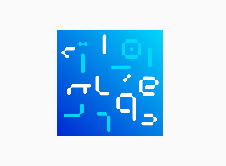
The Innoquest Graphic Device is a fixed composition of elements derived from its Logotype. This is available in three formats - circle, curved square and square. The Device should be used in accompaniment of the Innoquest Logo.
CIRCLE DEVICE
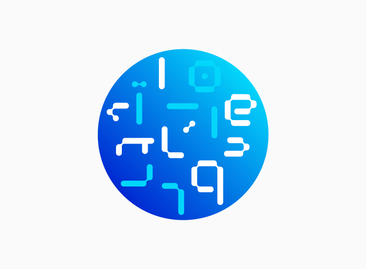
CURVED SQUARE DEVICE
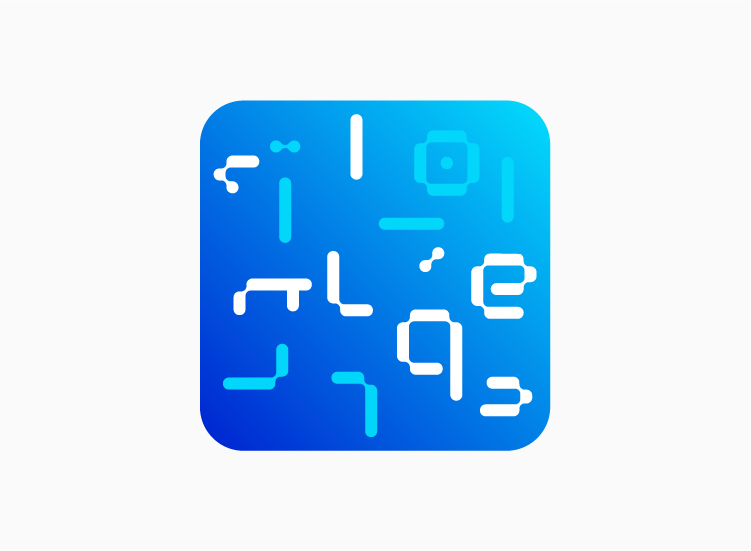
SQUARE DEVICE
ELEMENTS
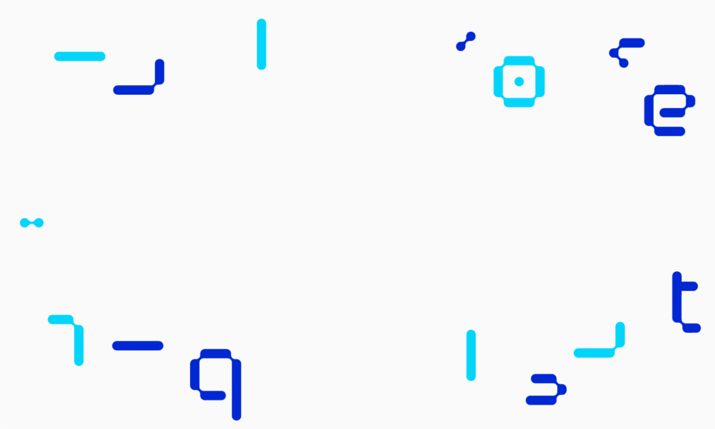
The Graphic Elements are derived from the Innoquest Logotype. There are a total of 15 parts. These should be scaled as one unit and can be recomposed as a supporting element to enhance the piece of communication, i.e. Brochures. For examples of use, please refer to the Applications section.
COLOUR ELEMENTS
COLOUR ELEMENTS IN COMPOSITION
REVERSE COLOUR ELEMENTS
REVERSE COLOUR ELEMENTS IN COMPOSITION
TYPEFACE
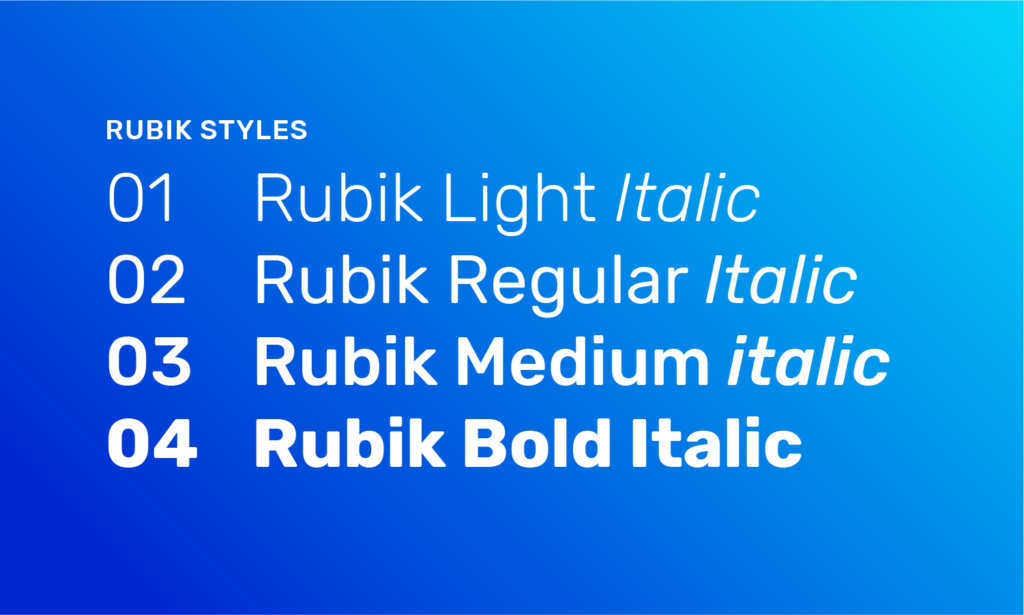
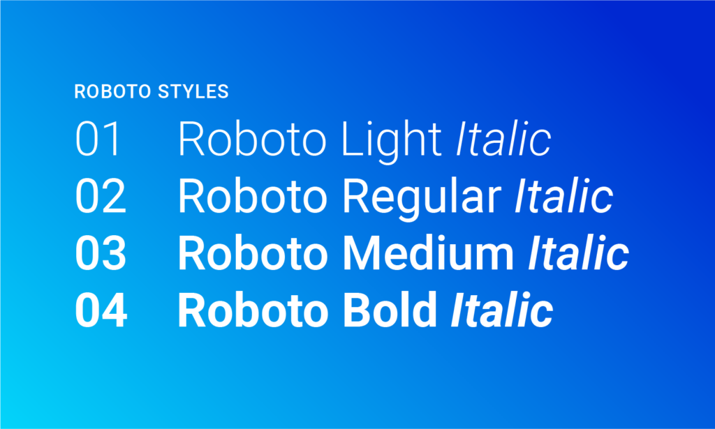
There are two typefaces selected to complement the Innoquest visual identity. These are sans serif fonts - Rubik and Roboto, available from google.
PRIMARY - RUBIK
SECONDARY - ROBOTO
IMAGERY
With people at the heart of our brand, the style of photography should exude a sense of warmth, ingenuity and optimism. Always going beyond, images should also capture details with a different perspective.

TONALITY
It’s not what we say, but how we say it and what people hear.
We communicate in a clear and concise manner that allows us to communicate confidently, effectively and professionally – always conveying a sense of certainty in all communications, giving assurance to everyone.

